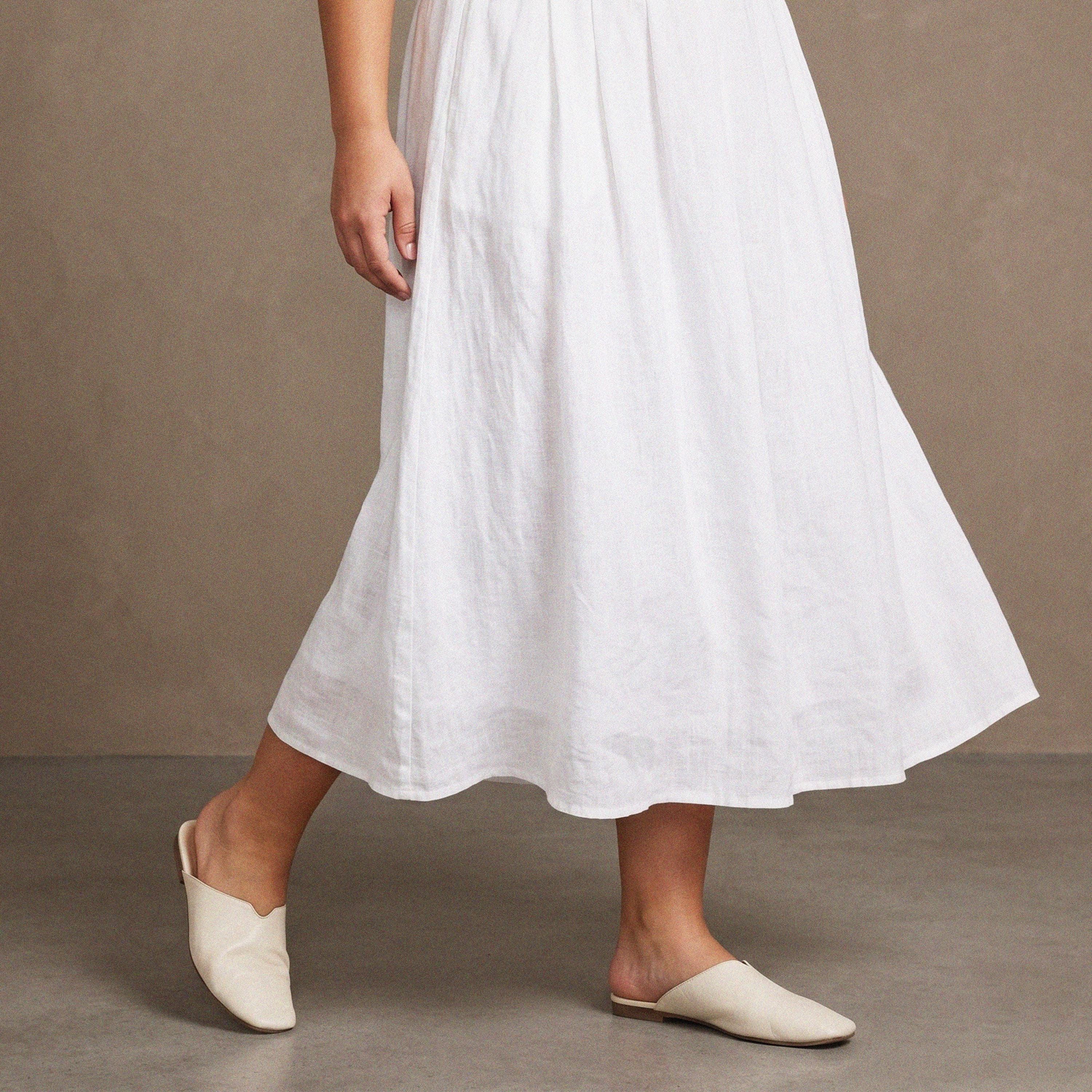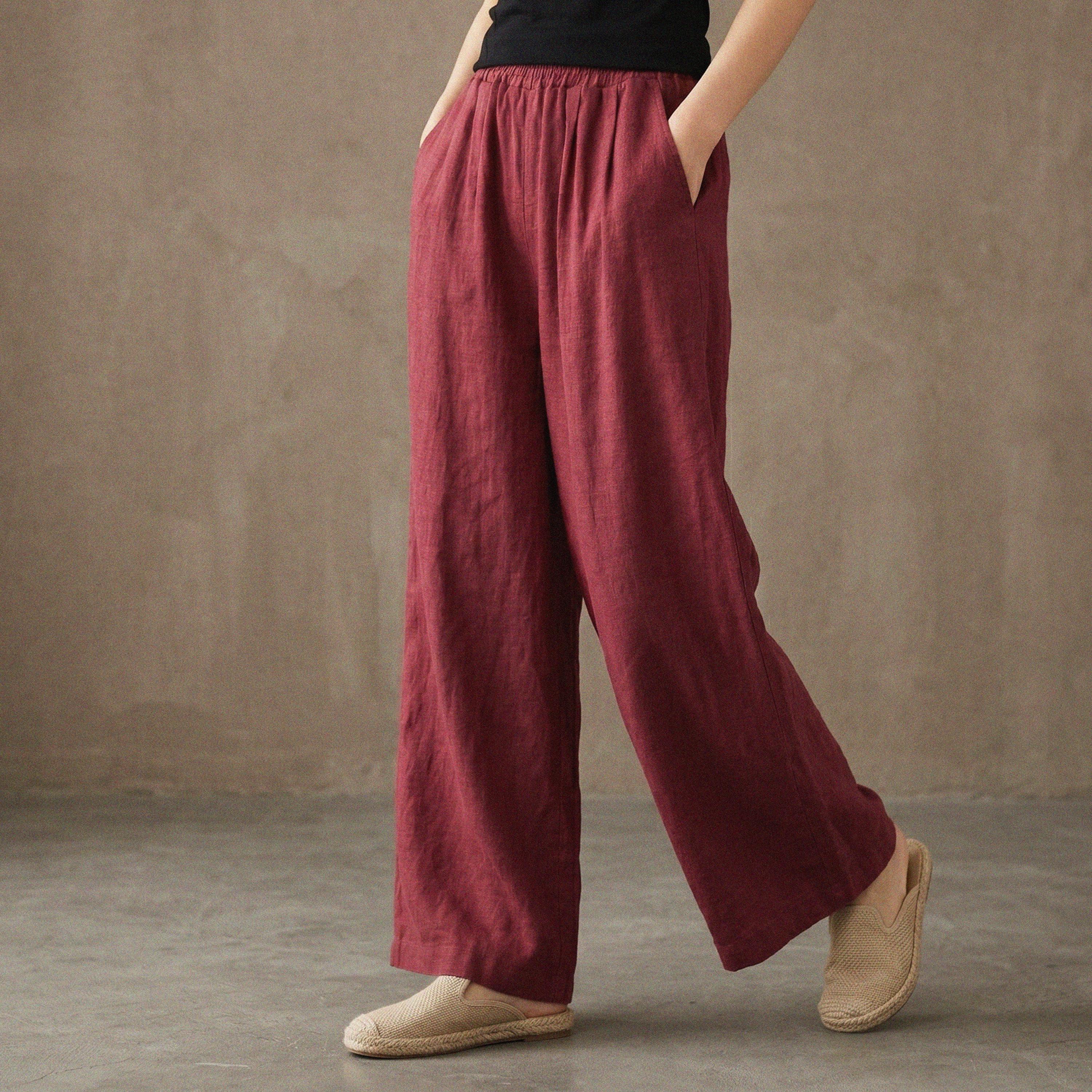
Wearing bold color can feel risky, but it doesn’t have to dominate your whole look. A softer approach keeps color as the star without overwhelming your outfit or your day. Below are practical strategies—specific pairings, fabrics, and silhouette choices—that let saturated shades feel refined and wearable for work, weekends, and everything in between.
Tone down with muted companions
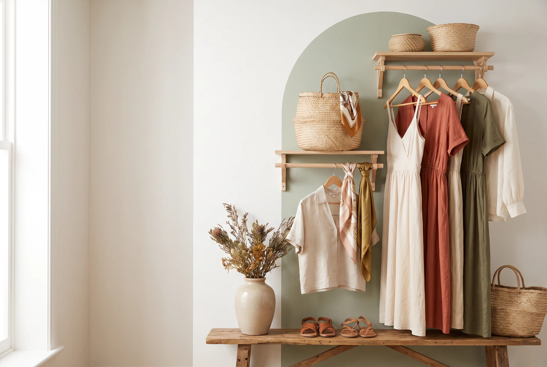
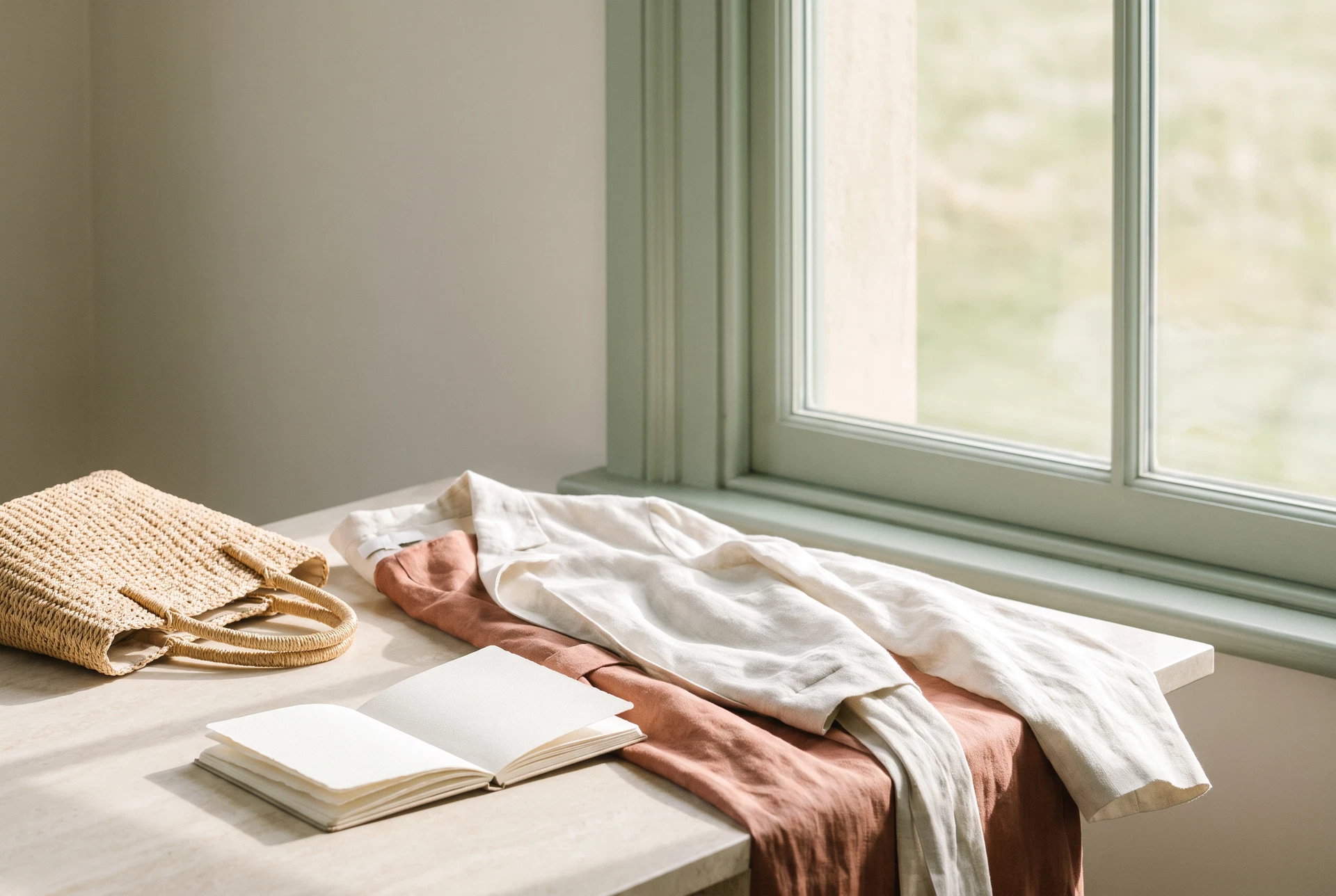
Pair a bright piece with a muted counterpart to make the color read intentional rather than loud. For instance, wear a richly colored blouse under a a favorite piece from the current collection left unbuttoned as a lightweight layer; the dress’s warm brown will soften the intensity of the hue and create an approachable, layered look.
Choose companions from the same tonal family but a few steps lighter or dusted with gray. A jewel-toned top with a mushroom or camel knit, or a cobalt skirt with a slate blazer, keeps visual contrast interesting without high drama.
Soften with texture and matte finishes
Textures reduce visual glare. Reach for matte or brushed fabrics—linen blends, sueded denim, cotton poplin—that absorb light and mellow bright colors. A a favorite piece from the current collection, for example, lends structure in a low-sheen denim that can tone down a saturated accessory like a coral scarf or bright bag.
Add tactile interest through knits, suede, or a softly brushed wool; a chunky neutral cardigan over a vivid slip dress or a suede belt cinched at the waist will ground a bright color palette while keeping the outfit cozy and approachable.
Control impact with restrained silhouettes
Silhouette affects perception: a minimalist shape lets color read calm. Opt for clean lines and modest proportions—straight-leg trousers, midi skirts, or a shirt dress—to keep a bold shade from feeling overpowering. A single bold piece in a tailored silhouette, like a crisp blouse tucked into neutral trousers, looks confident rather than theatrical.
Conversely, when you choose voluminous or highly detailed garments, balance them with softer colors. A dramatic sleeve or ruffled hem works best in a dusty rose or muted mustard when paired with sleek neutrals so the design reads intentional, not overwhelming.
Anchor brightness with small, grounded accents
Use small neutral anchors to stabilize bright colors—a leather belt, simple loafers, or a structured crossbody. These pieces provide visual punctuation and keep the color from floating free. For example, pair a vivid dress with tan ankle boots and a minimal cognac belt for a cohesive, softened finish.
Consider dividing the color field. A bright top plus a neutral bottom reads softer than a head-to-toe block. If you want more color, repeat it in small accessories—earrings, a scarf corner, or socks—to create rhythm without volume.
Softening bold color is about choices: companion tones, texture, shape, and subtle anchors. Use these tactics to make vibrant pieces feel polished and approachable—so you can enjoy color every day with confidence.
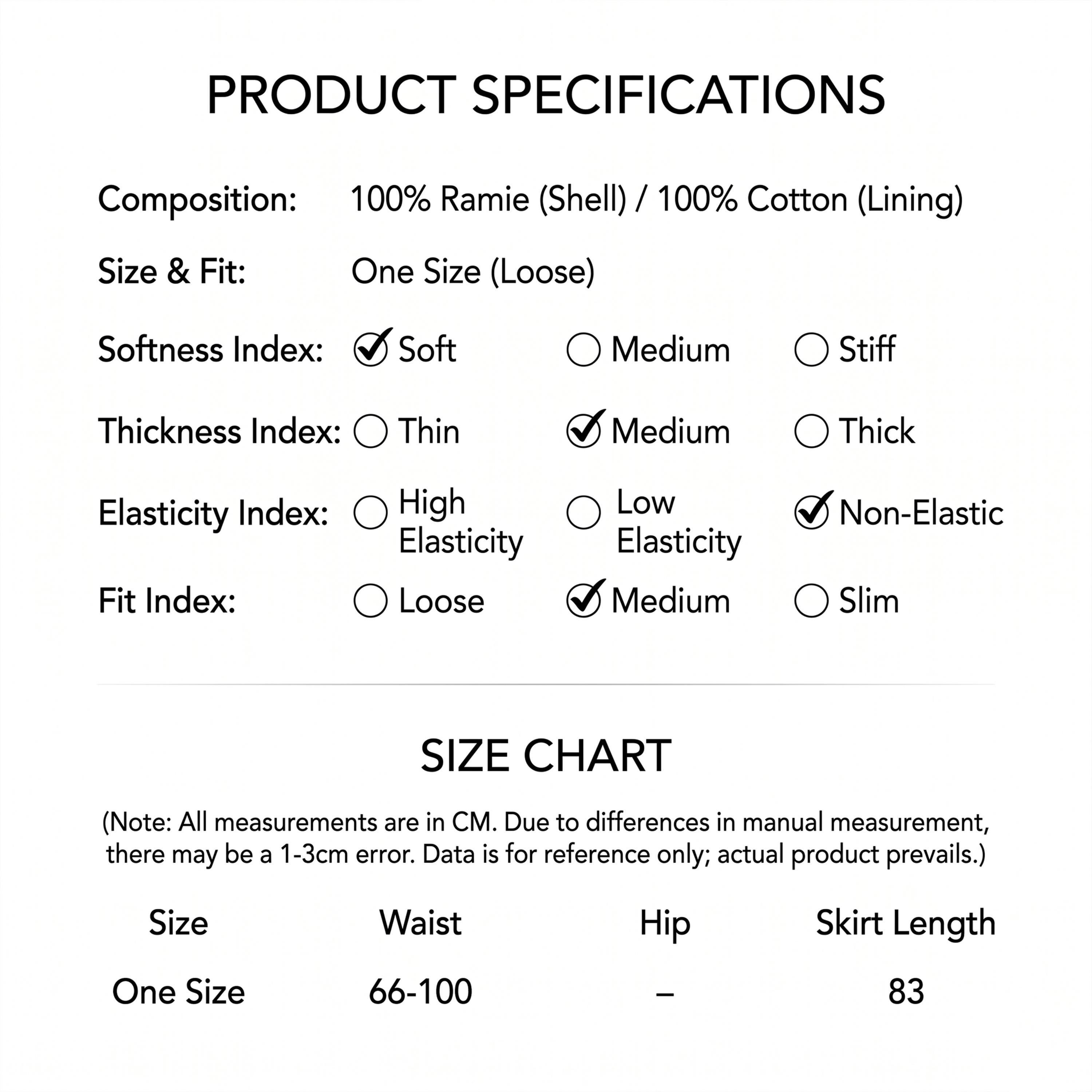
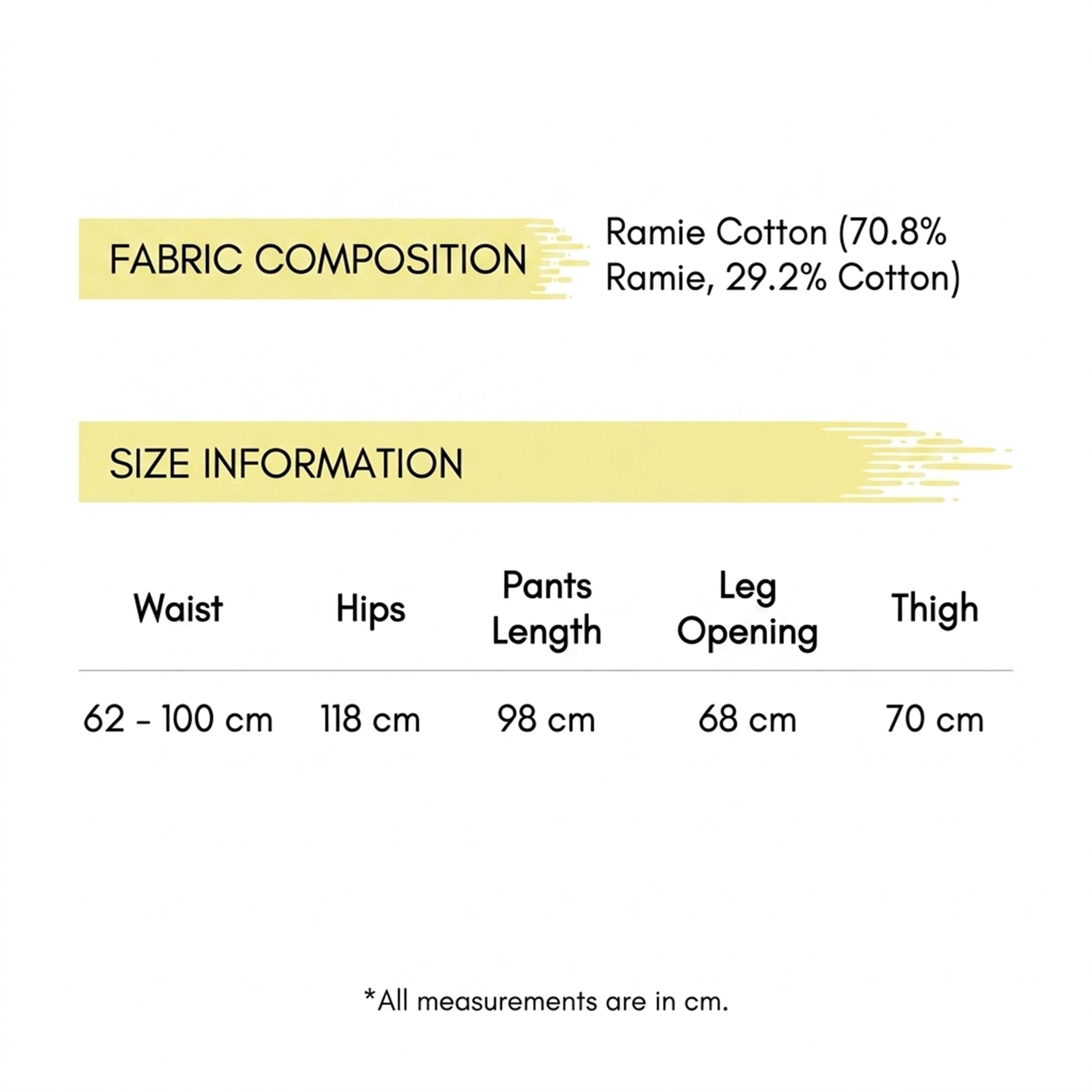
A few pieces to make it yours.
Related catalog pieces, not the exact items in our editorial photographs.